Live Angular Demo
Try the full demo app with a live theme editor at sjssdemo.netlify.app. Edit palette, spacing, and typography in real time.
Install
npm i super-jssSuper JSS (SJSS) is atomic CSS‑in‑JS for Angular: write styles as plain JavaScript objects with the [sj] directive, use theme tokens for colors/spacing/typography, and ship tiny runtime‑generated CSS with responsive breakpoints built in.
Try it
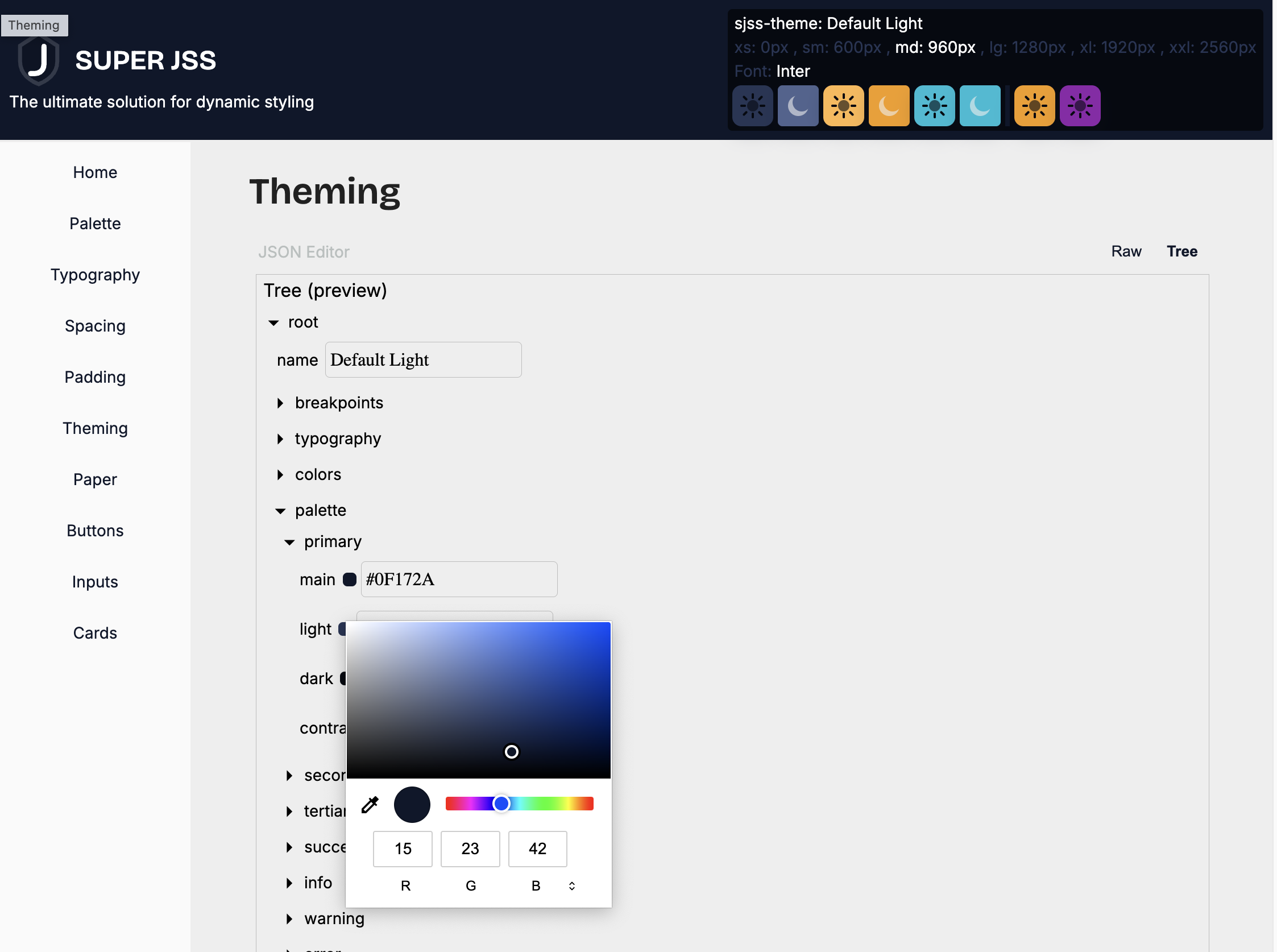
Live StackBlitz demo (Palette)
If the embed doesn’t load locally, open it directly: Open on StackBlitz.